Modern CSS Styling Guide: Build Beautiful and Responsive Websites in 2026
Learn modern CSS styling techniques including Flexbox, Grid, Glassmorphism, responsive design, animations, and best practices to build fast, beautiful websites.
If you've been building websites for a while, you'll probably remember a time when CSS felt more like a battle than a design tool.
Centering a simple element could take longer than writing the HTML itself. Developers relied on floats, clearfix hacks, negative margins, and browser-specific fixes just to achieve layouts that today take only a few lines of code. Every browser seemed to have its own personality, and getting a design to look consistent across devices often felt impossible.
Thankfully, web development has come a long way.
Modern CSS has quietly transformed how websites are built. It has made layouts cleaner, designs more responsive, and development much more enjoyable. Instead of spending hours fixing alignment issues, developers can now focus on what really matters: creating better experiences for users.
In this article, we'll explore how modern CSS has evolved and why it has become one of the most powerful tools in front-end development.
The Shift From "Making It Work" to "Making It Beautiful"
When websites first became popular, the main goal was simple: make the page display correctly.
Design was often an afterthought.
As the internet evolved, expectations changed. Visitors no longer wanted websites that simply worked. They expected fast loading pages, smooth interactions, elegant layouts, and seamless experiences across phones, tablets, and desktops.
CSS had to evolve alongside those expectations.
Today, CSS is no longer just about changing colors or fonts. It plays a major role in user experience, accessibility, and even website performance.
The Day Flexbox Changed Everything
Ask any experienced web developer about Flexbox, and chances are they'll smile.
Before Flexbox, aligning elements vertically was surprisingly difficult. Building navigation bars, pricing cards, or even a simple centered login form required clever workarounds that were difficult to maintain.
Flexbox changed that almost overnight.
Instead of fighting with layouts, developers could finally describe what they wanted in a way that made sense. Want items centered? Done. Need equal spacing? Easy. Building responsive navigation suddenly became straightforward instead of frustrating.
It wasn't just a new CSS feature. It completely changed the way developers approached layouts.
Then Came CSS Grid
If Flexbox simplified one-dimensional layouts, CSS Grid took things even further.
Building complex page structures used to involve nested containers, complicated calculations, and countless media queries.
Grid introduced a much cleaner way of thinking.
Instead of forcing elements into position, developers could define the structure first and let the browser handle the rest. Portfolio websites, dashboards, product galleries, and magazine-style layouts became significantly easier to create.
The result wasn't just cleaner code. It was code that was easier to understand months later.
Responsive Design Is No Longer a Bonus
There was a time when websites were designed for desktop computers first, with mobile users considered later.
That approach no longer works.
Today, most visitors arrive from smartphones. If your website doesn't adapt naturally to different screen sizes, visitors won't stay for long.
Modern CSS encourages developers to think differently. Instead of asking, "How will this look on mobile?" the better question is, "How should this experience feel on every device?"
That simple shift in thinking has made websites more accessible and far more enjoyable to use.
Simplicity Became the New Luxury
Web design has gone through many trends.
There were years filled with glossy buttons, heavy gradients, flashing animations, and decorative effects everywhere.
Modern interfaces tell a different story.
Today's best websites often feel calm. They use generous spacing, clear typography, subtle shadows, and carefully chosen colors. Every element has a purpose, and unnecessary decoration is left behind.
Ironically, creating a simple interface often requires more thought than creating a complicated one.
Small Details Create Big Experiences
The websites people remember are rarely the ones with the loudest designs.
They're the ones that feel smooth.
A button gently responds when hovered.
A card lifts slightly as the mouse moves over it.
A form provides immediate feedback after submission.
These small interactions may seem insignificant on their own, but together they create an experience that feels polished and professional.
Modern CSS makes these details easier to implement than ever before.
CSS Variables Made Design Easier to Maintain
Anyone who has worked on a large website knows how quickly stylesheets can become difficult to manage.
Imagine deciding to change your brand color after hundreds of pages have already been built.
Years ago, that often meant searching through countless CSS files.
Today, CSS variables solve that problem elegantly.
Instead of repeating colors, spacing values, and font sizes throughout your code, you define them once and reuse them everywhere. A single change can update the entire website consistently.
It may sound like a small improvement, but it saves hours of work on larger projects.
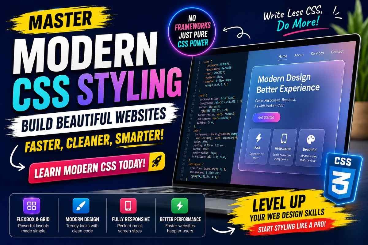
The Rise of Glassmorphism and Modern Interfaces
Design trends continue to evolve, but one style that has captured attention in recent years is Glassmorphism.
You've probably seen it already.
Soft translucent cards floating over blurred backgrounds.
Clean login forms with subtle transparency.
Modern dashboards that feel light instead of crowded.
When used carefully, Glassmorphism adds depth without overwhelming the content. Like any design trend, moderation is important. The goal isn't to show off visual effects. It's to improve readability and create focus.
Performance Is Now Part of Design
A beautiful website that takes ten seconds to load is no longer considered beautiful.
Visitors expect speed.
Search engines reward speed.
Modern CSS encourages developers to achieve more with less. Native browser features often replace heavy libraries, resulting in faster loading times and smoother experiences.
Good design is no longer measured only by appearance. It is measured by how quickly users can interact with your content.
Accessibility Is No Longer Optional
One of the biggest changes in modern web design isn't visual at all.
It's the growing understanding that websites should work for everyone.
Clear typography, proper contrast, keyboard navigation, visible focus states, and thoughtful spacing are now considered essential parts of good design.
The most successful websites are those that welcome every visitor, regardless of how they browse the web.
So, What Does Modern CSS Really Mean?
Many people think modern CSS is about learning new properties or following the latest design trend.
In reality, it's about changing the way we think.
Instead of forcing layouts into place, we describe them naturally.
Instead of adding more effects, we remove distractions.
Instead of designing only for large screens, we build experiences that work everywhere.
Modern CSS isn't simply a collection of features.
It's a philosophy of creating websites that are faster, cleaner, easier to maintain, and more enjoyable to use.
Final Thoughts
Every generation of web developers remembers a moment when building websites became easier than it used to be.
For many of us, modern CSS was that moment.
The tools we have today allow us to spend less time fighting layouts and more time solving real problems for users. Flexbox, Grid, custom properties, responsive design, and native animations have transformed CSS into one of the most powerful technologies on the web.
If you're learning web development today, you're starting at an exciting time. The foundations are stronger than ever, the browser support is excellent, and the possibilities are almost endless.
The best websites are not created by using every new CSS feature.
They're created by understanding when simplicity is the most powerful design choice.
Frequently Asked Questions
What is modern CSS?
Modern CSS refers to the latest styling techniques and browser features that help developers create responsive, maintainable, and visually appealing websites with less code.
Is Flexbox better than CSS Grid?
They solve different problems. Flexbox works best for arranging items in a single direction, while Grid is ideal for building complete page layouts with rows and columns.
Do I still need Bootstrap to build modern websites?
Not always. Modern CSS includes many native features that reduce the need for large front-end frameworks, although Bootstrap can still be useful for rapid development.
Why is responsive design so important?
People browse websites on phones, tablets, laptops, and large monitors. Responsive design ensures that your website provides a consistent experience across all of them.
What is Glassmorphism?
Glassmorphism is a modern design style that uses transparency, blur, and soft shadows to create a frosted glass appearance for interface elements.
Is modern CSS difficult to learn?
Not at all. If you already know the basics of CSS, learning modern techniques like Flexbox and Grid becomes much easier with practice and real-world projects.